Timechart
For information on configuring a chart, see Create a New Panel.
Time aggregation: For example, the average value of sysdig_host_cpu_used_percent metric is computed for each entity over 1 hour at 1-minute intervals.
Group Rollup: For each host_hostName the values from time aggregation are averaged over the scope and the top 10 segments are shown on the chart.
Types of Timecharts
| Type | Preview |
|---|---|
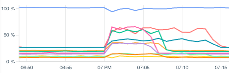
| Line |
|
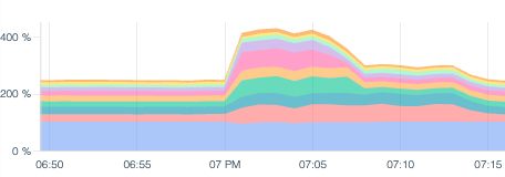
| Stacked Area |
|
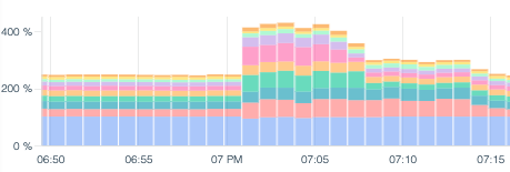
| Stacked Bars |
|
Timechart look and feel can be configured under Display settings when configuring a panel.
When to Use
| Type | Use case |
|---|---|
| Line | When quickly identifying outlier segments is important. When plotting a single metric over time. |
| Stacked Area | When an aggregate view of segments is needed. |
| Stacked Bars | When metrics are sometimes reporting zero. |
Time Selection
The amount and granularity of data visualized in the timechart is dependent on the time selection within the Dashboard. You can change the time selection with the time scope bar at the bottom of the UI.
Granularity
Timchart panels dynamically choose the appropriate granularity in order to balance maximum resolution with acceptable performance. For a 10-second granular metric such as sysdig_container_cpu_used_percent, the below table can be used as a reference.
| Time Interval | Sampling used |
|---|---|
| Up to and including 2 hours. | 10 seconds |
| Greater than 2h, up to and including 12 hours. | 1 minute |
| Greater than 12 hours, up to and including 5 days. | 10 minutes |
| Greater than 5 days, up to and including 30 days. | 1 hour |
| Greater than 30 days. | 1 day |
Timecharts are optimised to refresh as soon as new data is available. As a consequence, if a dashboard contains timechart as well as non-timechart panels, the former might have a higher refresh date.
Granularity does not affect Metric Retention.