Data Aggregation
Data Aggregation Concepts
Data Sampling
Sysdig agents collect 1-second samples and reports data at a 10-second resolution. This is the finest resolution at which Sysdig Monitor stores data. The agent accomplishes this by downsampling from 1-second to 10-second samples.
This is true for all the metrics, except Prometheus. For Prometheus metrics, data is sampled every 1 second, but what is reported in the 10-second interval is the latest value, not the downsample.
Samples are stored at 10-second resolution. As new data arrives, samples are rolled up to higher downsampled timelines periodically. For example, the data registered every 10 seconds is rolled up in blocks of 1-minute intervals, and the data stored in blocks of 1-minute is rolled up to 10-minute blocks.
Downsampling
Downsampling refers to the process of aggregating multiple samples, on a defined time interval into a set of values which can provide estimation for aggregated time ranges. In Sysdig parlance, downsampling is nothing but the data aggregation performed before exposing it as time aggregation on the UI or by the API. In effect, the data available for time aggregation during query evaluation is not the raw data, but the values that represent the estimated values for the given time range.
Downsampling reduces data retention costs as well as improves query performance by reducing the amount of data loaded during query evaluation.
Downsampled data is used only for longer time ranges. If you are viewing the most recent data, such as 10 minutes or the last 1 hour, raw data is used for evaluation.
Data Rollup
Sysdig Monitor rolls up historical data over time. For example, the data collected every 10 seconds is aggregated and rolled up in blocks of 1-minute intervals. From the recorded values in 1-minute rollups, data is rolled up again for a block of 10-minute intervals.
Sysdig downsampling produces data rollups of aggregated samples. In each data rollup, Sysdig calculates and records 4 values: maximum, minimum, sum, and count. These values form the basis for the following time aggregations in the UI and APIs:
maxminsumcountavgraterateOfChange
Data Resolution
Data resolution is the frequency with which the data is displayed. Sysdig Monitor supports the data resolution of 10 seconds, 1 minute, 10 minutes, 1 hour, and 1 day.
Time and Group Aggregations
There are two forms of aggregation used for metrics in Sysdig: time aggregation and group aggregation. Time aggregation is always performed before group aggregation.
Time Aggregation
Time aggregation comes into effect in two situations (that can sometimes overlap):
- Aggregation: Graphs can only render a limited number of data points. To look at a wide range of data, Sysdig Monitor aggregates granular data into larger blocks of samples for visualization as given in Data Downsampling.
- Data Rollup: Sysdig retains rollups based on each aggregation type to allow users to choose which data points to utilize when evaluating older data.
Aggregation Types
| Aggregation Type | Description |
|---|---|
| average | The average of the retrieved metric values across the time period. |
| rate | The average value of the metric across the time period evaluated. |
| maximum | The highest value during the time period evaluated. |
| minimum | The lowest value during the time period evaluated. |
| sum | The combined sum of the metric across the time period evaluated. |
Difference Between Rate and average
Rate and average are very similar and often provide the same result. However, the calculation of each is different.
If time aggregation is set to one minute, the agent is supposed to retrieve six samples (one every 10 seconds).
In some cases, samples may not be there, due to disconnections or other circumstances. For this example, four samples are available. If this was the case, the
averagewould be calculated by dividing by four, while theratewould be calculated by dividing by six.
Most metrics are sampled once for each time interval, resulting in
averageandratereturning the same value. However, there will be a distinction for any metrics not reported at every time interval. For example, some custom statsd metrics.Rate is currently referred to as
timeAvgin the Sysdig Monitor API and advanced alerting language.By default,
averageis used when displaying data points for a time interval.
Time Aggregation on the UI
On the Sysdig Monitor UI, you select the time aggregation from the Metric drop-down.
Depending on the time range you have selected, how old the data is, and what the resolution is, panels display data at a granularity of 10 seconds, 1 minute, 10 minutes, 1 hour, and 1 day.
The number of data points displayed in Timecharts across Sysdig Monitor will vary depending on two factors:
- The time interval (the number of seconds between the requested start and end time)
- The underlying metric granularity (the frequency at which the metric was scrapped)
Visualization panels are built to maximize the number of data points displayed within the requested time interval while making it user-friendly.
To learn more about this concept, check Sampling.
Group Aggregation
Metrics applied to a group of items (for example, several containers, hosts, or nodes) are averaged between the members of the group by default. For example, three hosts report different CPU usage for one sample interval. The three values will be averaged, and reported on the chart as a single datapoint for that metric.
There are several different types of group aggregation:
| Aggregation Type | Description |
|---|---|
| average | The average value of the interval’s samples. |
| maximum | The maximum value of the interval’s samples. |
| minimum | The minimum value of the interval’s samples. |
| sum | The sum of values of all of the interval’s samples. |
If a chart or alert is segmented, the group aggregation settings will be utilized for both aggregations across the whole group, and aggregation within each individual segmentation.
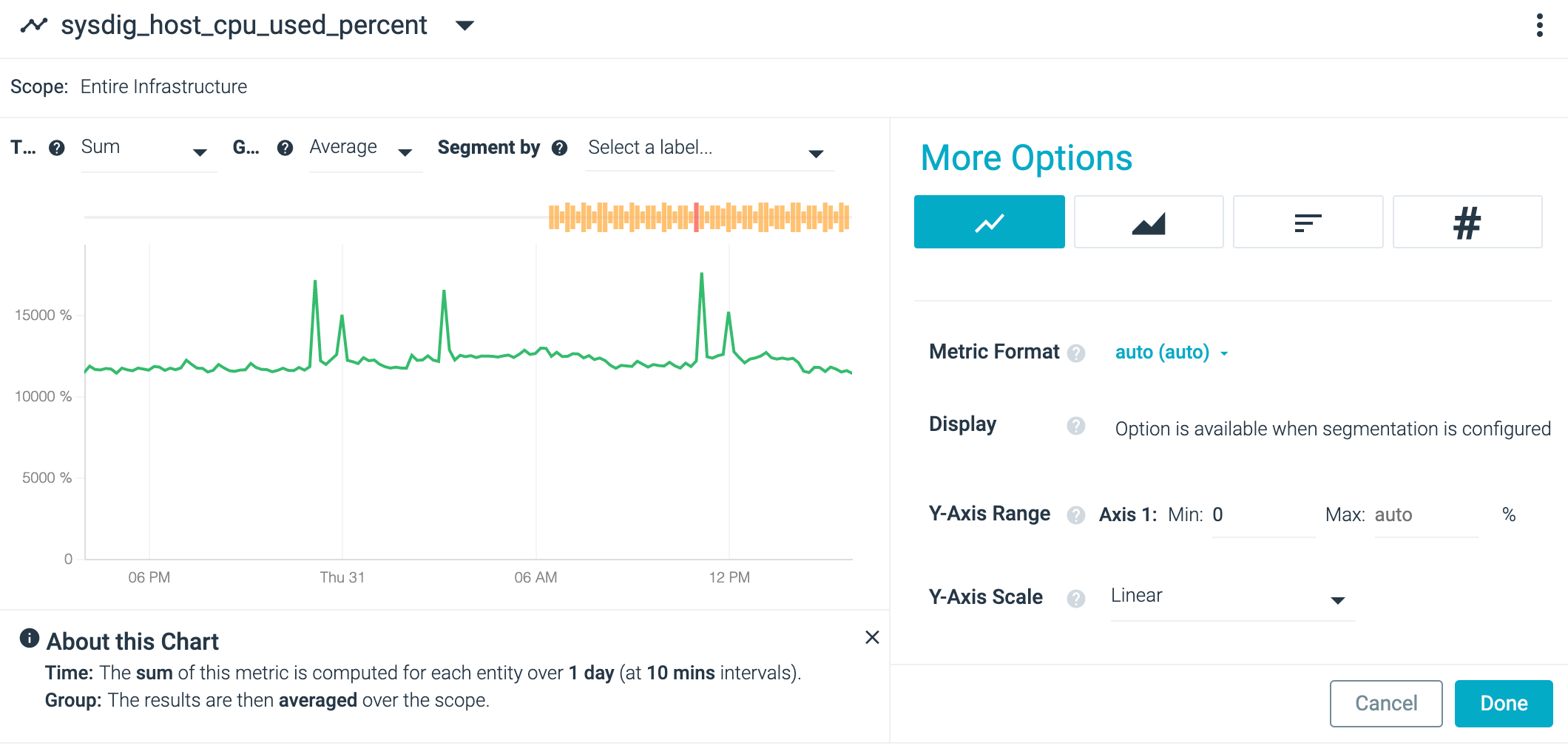
For example, the image below shows a chart for CPU% across the infrastructure:
When segmented by proc_name, the chart shows one CPU% line for each
process:
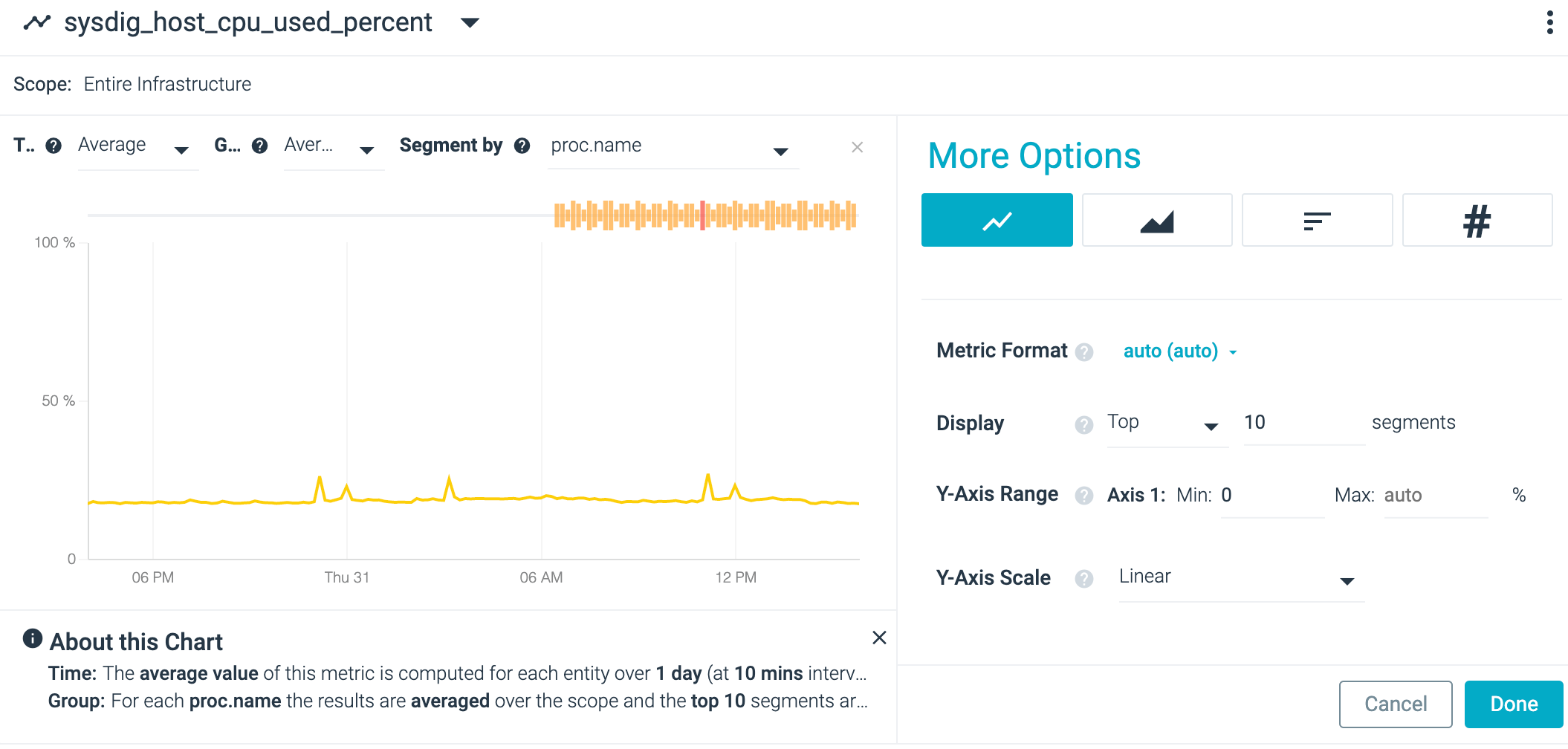
Each line provides the average value for every process with the same name. To see the difference, change the group aggregation type to sum:
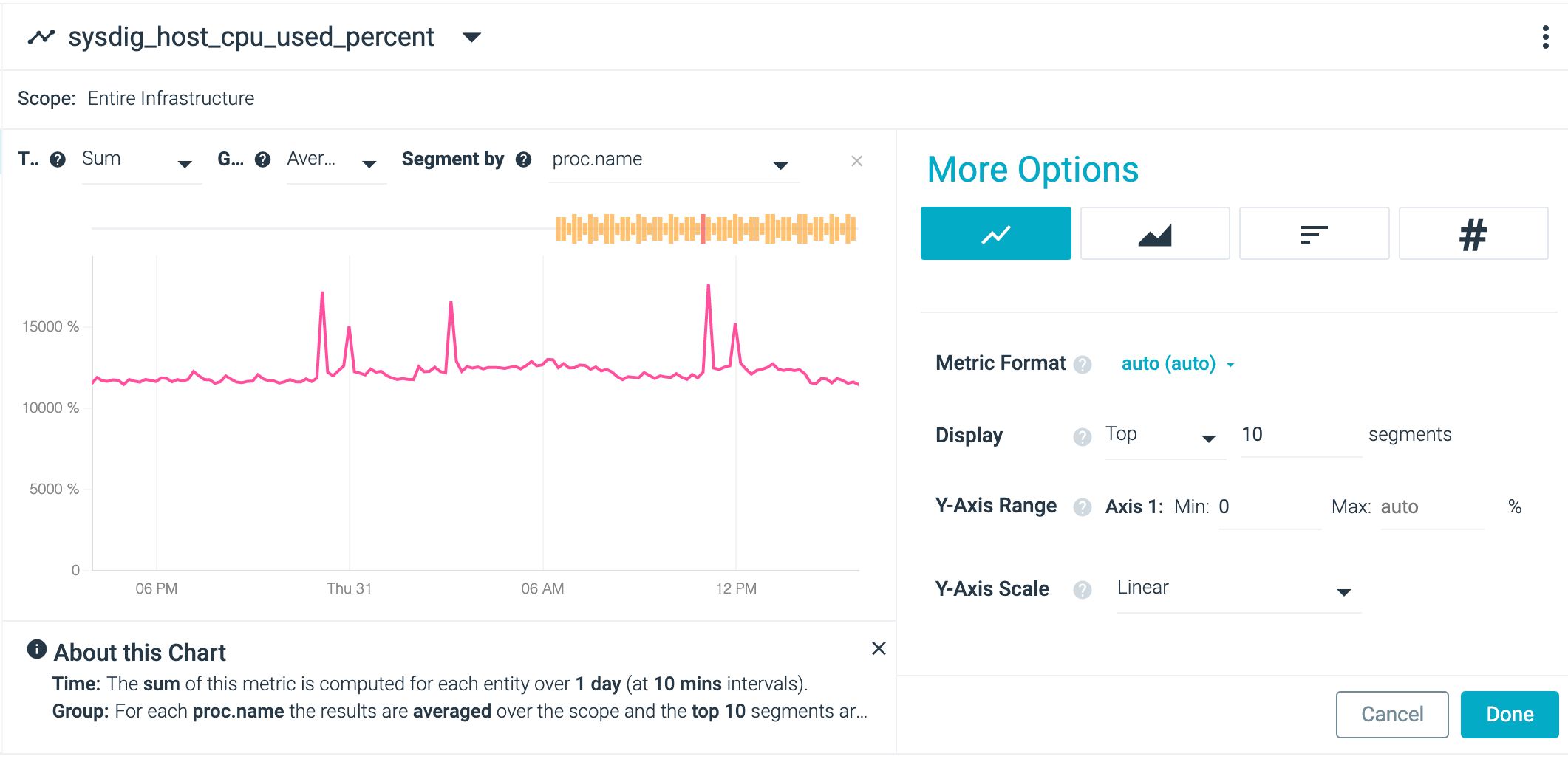
The metric aggregation value showed beside the metric name is for the
time aggregation. While the screenshot shows AVG, the group
aggregation is set to SUM.
Aggregation Examples
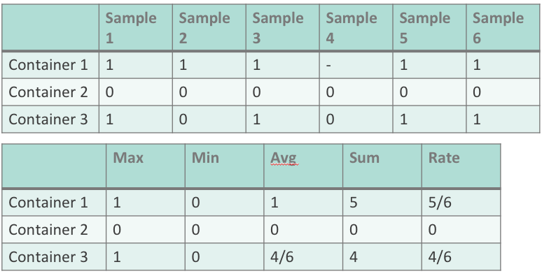
The tables below provide an example of how each type of aggregation works. The first table provides the metric data, while the second displays the resulting value for each type of aggregation.
In the example below, the CPU% metric is applied to a group of servers
called webserver. The first chart shows metrics using average
aggregation for both time and group. The second chart shows the metrics
using maximum aggregation for both time and group.
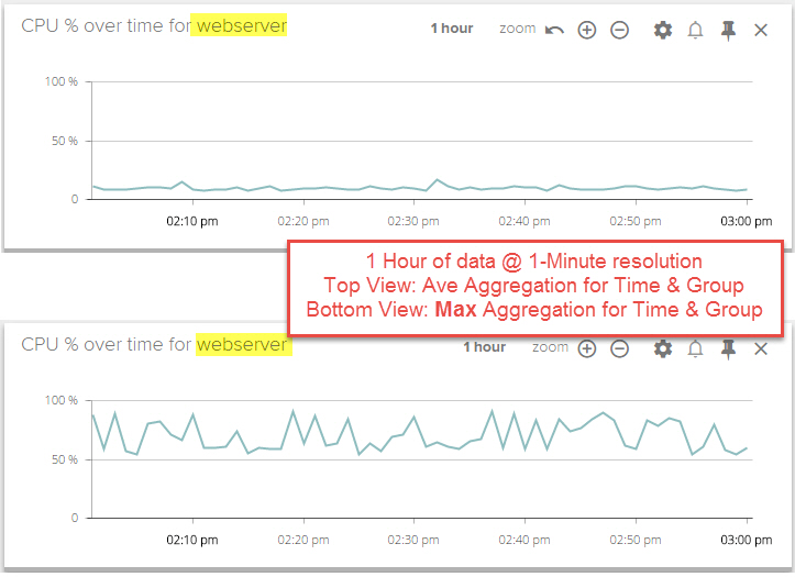
For each one minute interval, the second chart renders the highest CPU
usage value found from the servers in the webserver group and from all
of the samples reported during the one minute interval. This view can be
useful when searching for transient spikes in metrics over long periods
of time, that would otherwise be missed with average aggregation.
The group aggregation type is dependent on the segmentation. For a view
showing metrics for a group of items, the current group aggregation
setting will revert to the default setting, if the Segment By
selection is changed.
