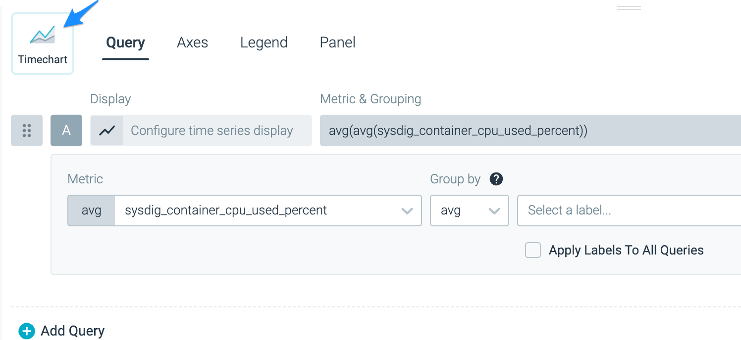
Gauge
The Gauge visualization in Sysdig Monitor is a powerful tool for representing single data points in a compact and visually appealing manner. It allows you to monitor and track specific metrics with support for thresholds and emphasis on deviation. The Gauge visualization supports various units, such as percentage, number, byte, rate, and dollar.
Overview
The Gauge visualization is most effective when used to represent single data points. It provides a concise and clear display, making it easy to understand the status and value of a metric or PromQL query at a glance. The key features of the Gauge visualization include:
- Compact display: The Gauge takes up minimal screen space, making it suitable for displaying multiple metrics in a limited area.
- Threshold support: You can define thresholds to visually indicate when a metric exceeds or falls below certain values. This helps in quickly identifying critical conditions.
- Emphasis on deviation: The Gauge visualization highlights deviations from normal values, making it easier to spot anomalies and performance issues.
- Unit support: You can choose the appropriate unit for your metric, whether it’s a percentage, a number, a byte, a rate, or a dollar value.
Usage
Configure Thresholds
To configure thresholds for a Gauge visualization:
- Click the Thresholds tab in the Gauge configuration.
- Define the desired thresholds by specifying the limits.
- Save the configuration.
Configure Minimum and Maximum
To configure the minimum and maximum values for a Gauge visualization:
- Click the Query tab in the Gauge configuration.
- Click the Min and Max values.
- Define the desired minimum and maximum values.
- Save the configuration.
Configure Units
To configure the unit for a Gauge visualization:
- Click the Query tab in the Gauge configuration.
- Click Options.
- Define the desired unit for the metric.
- Save the configuration.
Use Cases
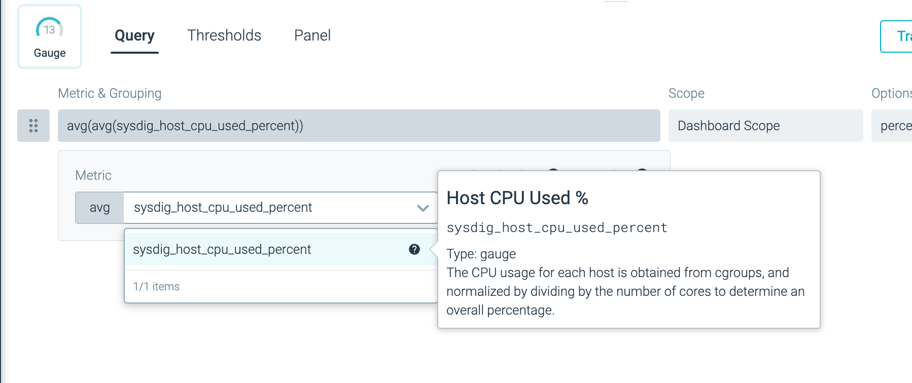
View CPU Usage of a Host
To view the CPU usage of a host using the Gauge visualization:
| Step | Preview |
|---|---|
| Click Add Panel to add a new panel to your dashboard. | Create a New Panel |
| Select Gauge as the visualization type. |
|
Choose the sysdig_host_cpu_used_percent metric to monitor the CPU usage of a host. |
|
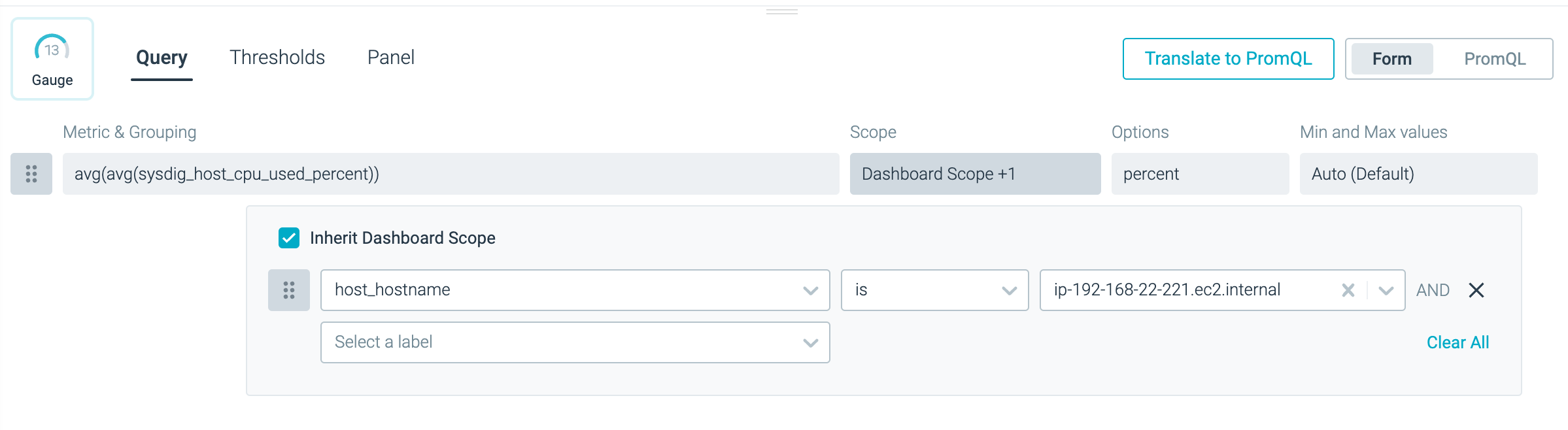
Optional: In the Scope section, restrict this panel to a specific host by choosing “host_hostname is <your-host-name>”. |
|
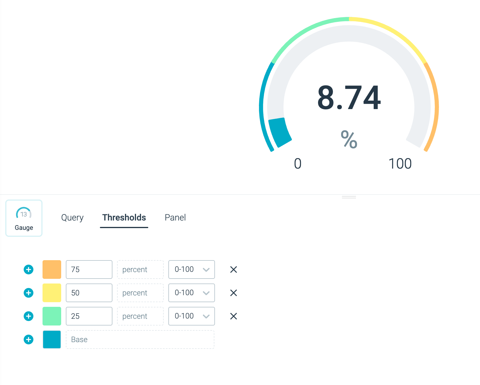
| Define four thresholds: 25, 50, 75, and 100. Thresholds indicate different levels of CPU usage. |
|
View Available to Desired Ratio of Pods
To visualize the ratio between available and desired pods in a Kubernetes cluster:
| Step | Preview |
|---|---|
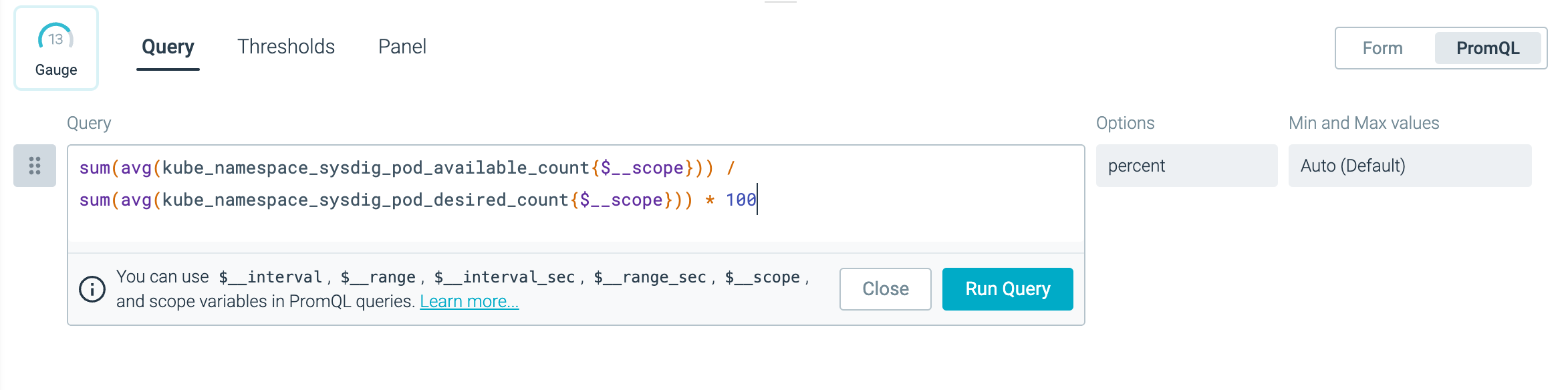
Click the PromQL tab. Enter the following PromQL query:sum(avg(kube_namespace_sysdig_pod_available_count{$__scope})) / sum(avg(kube_namespace_sysdig_pod_desired_count{$__scope})) * 100 |
|
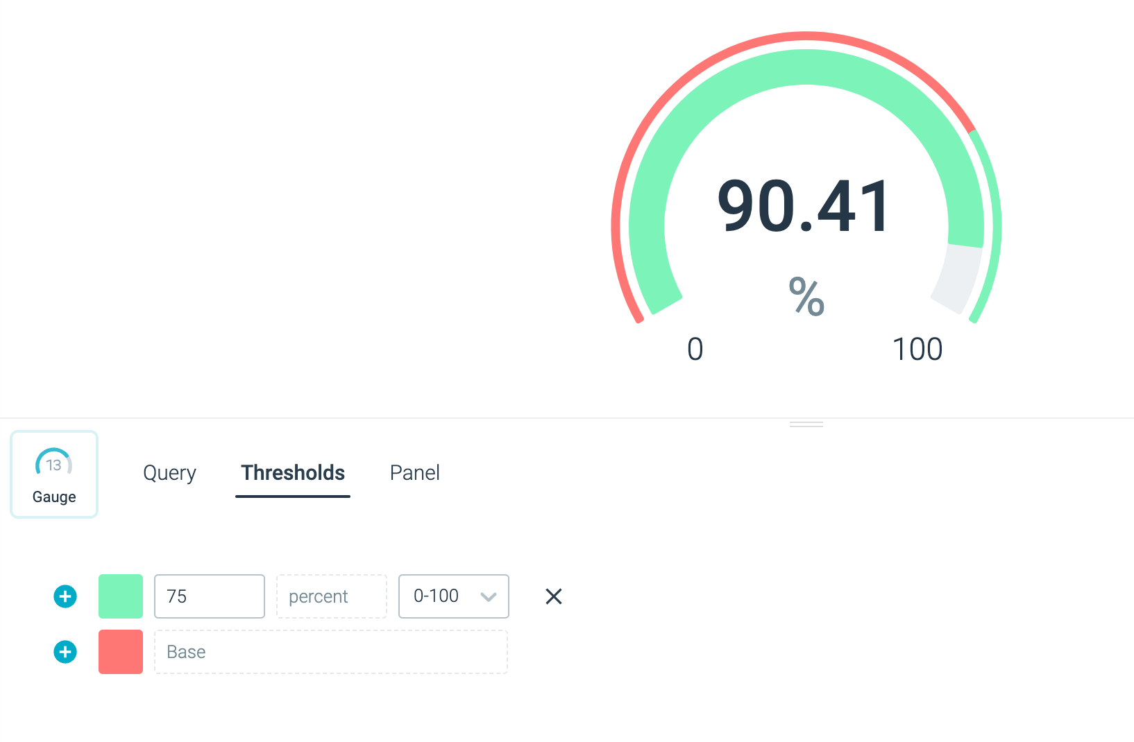
| Define a threshold of 75 to indicate the threshold for the pods available versus the desired ratio. |
|
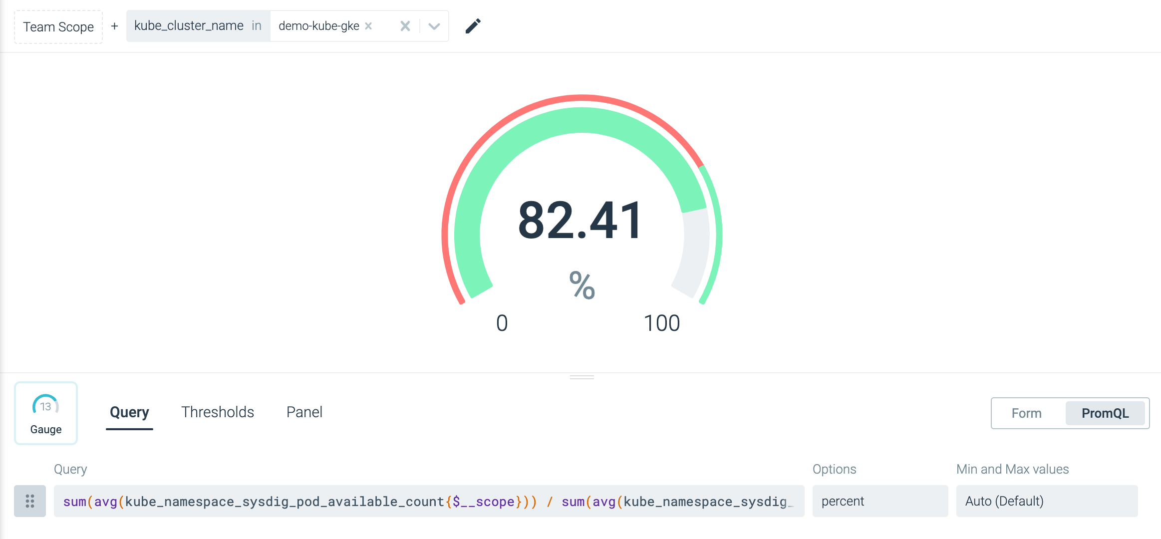
| Define a dashboard parameter to scope the dashboard to a cluster of your choice. |
|
Feedback
Was this page helpful?
Glad to hear it! Please tell us how we can improve.
Sorry to hear that. Please tell us how we can improve.